Here’s How to See Your Spotify ‘Pie Chart’
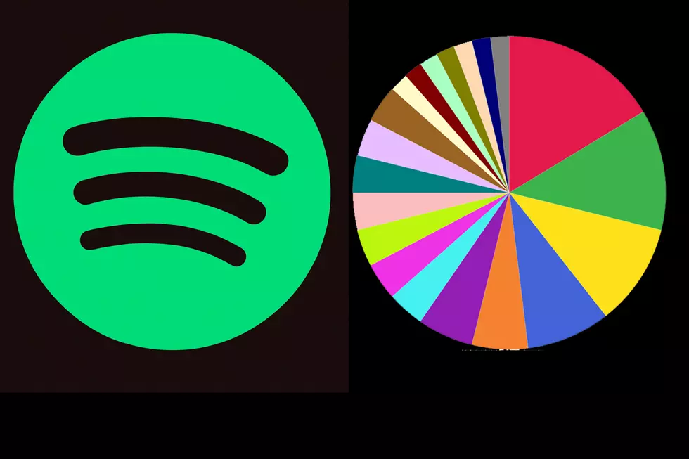
Thanks to a new third-party company, music streamers can now track their listening habits by genre using the Spotify Pie Chart.
The feature, developed by UCLA student Darren Huang, is fairly self-explanatory: Users enter the website, log in to their Spotify accounts and agree to the required terms, allowing the app to analyze their account data and activity. Seconds later, a multi-colored pie chart appears on the screen, bundling streams into highly specific genres. (This writer’s results included obvious styles like "modern rock," "indie rock" and "rap" but also "conscious hip hop," "Quebec indie," "UK contemporary jazz" and "baroque pop.")
The breakdown offers a legend matching colors to genres. Below that, each user’s most-played artists are listed from top to bottom, with the font decreasing in size.
As the site points out ("Bake Your Monthly Genre Pie"), the charts can be updated every month — a more frequent alternative to Spotify’s official Wrapped feature, which provides a year-end overview of most-streamed music and artists. Huang’s tool, exclusive to Spotify streaming, works on both mobile and desktop.
There are many other popular tools to analyze your listening. And some of these platforms that a humorous approach, judging you by the perceived quality and trendiness of your taste: Obscurify analyzes the obscurity or "basic"ness of one’s streaming, even recommending "under-the-radar songs you might like"; meanwhile, with How Bad Is Your Streaming Music?, which uses either Spotify or Apple Music, "sophisticated A.I. judges your awful taste in music."
Top 40 Rock Singers
More From Big Stack 103.9


